

Instagram’s website has been redesigned. On the face of it, that’s very nice but there’s not a lot to shout about.
It does look better, certainly. Only three images are seen per row, compared with five beforehand, so making the images bigger.
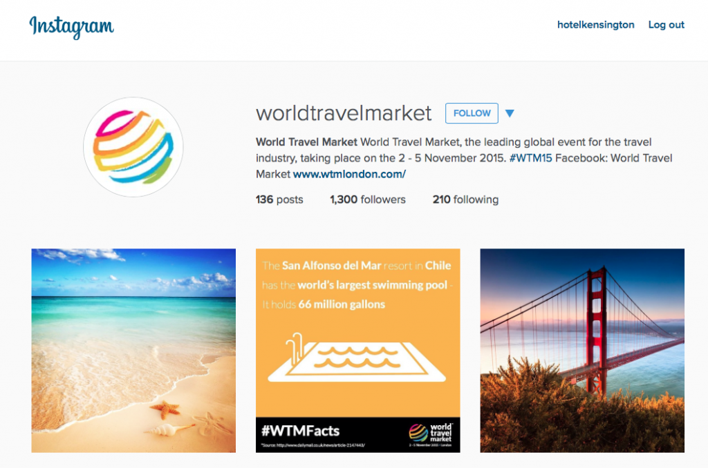
The rotating, tiled masthead has gone, and the avatar image has become a circle. In fact, it looks a lot more like the Instagram app.
The website also looks a lot cleaner: it allows the photos to breathe against a very neutral background (particularly effective when images are strong, such as the Tube shots by @MissUnderground. There are also only 12 photos on the page with no automated loading of more images.
It is, in short, simple.
Which is how any website or blog should now be. If a responsive website, then that design makes sense as it will mutate to serve any mobile platform, where simple most certainly works best.
But Instagram’s move also demonstrates how design has moved so decisively in the past five years, away from the kitchen sink approach (throw everything at it!) to a less-is-more philosophy.
Spurred largely by the need to address all platforms, there is also an aesthete’s approach (definition: a person who is appreciative of and sensitive to art and beauty).
Other photo sharing sites, such as Flickr and Vsco, have also redesigned recently and the trend is evident on most new blogs: understating, rather than adding more bells and whistles.
It also seems to be partly a response to there being too much content out there now (and forever, in the future): it’s easier to dwell on a site that doesn’t assault the eyeballs, and respects viewers’ ability to now search and find for hidden content.
The Instagram move hasn’t delighted all people, naturally. Many commentators grumble that IG would be better off spending its time creating an iPad app, or allowing users to manage multiple accounts without the need to log out of each.
In a blog post on Petapixel.com – ‘Instagram rolls out new website redesign focused on minimalism’ – one comment complains: “Not a fan of white websites. It hurts to look at, especially with larger screens.”
And @RussianBox was not alone. On the same post, @macroblue added: “Ugh. I really don’t like this. It’s so “simple” I feel like I’m not looking at anything at all. It’s like looking at a blank page. Where’s the charm?”
You can’t please all of the people all of the time….